
Rethinking navigation
Photo : Maxime De Hulster

Rethinking navigation
Photo : Maxime De Hulster
This is the first thing you discovered when you opened the new version of Trackkarma: we have completely redesigned the interface and navigation of the application. This result is the fruit of a long work of analysis and reflection aimed at making the use of Trackkarma even simpler and more intuitive.
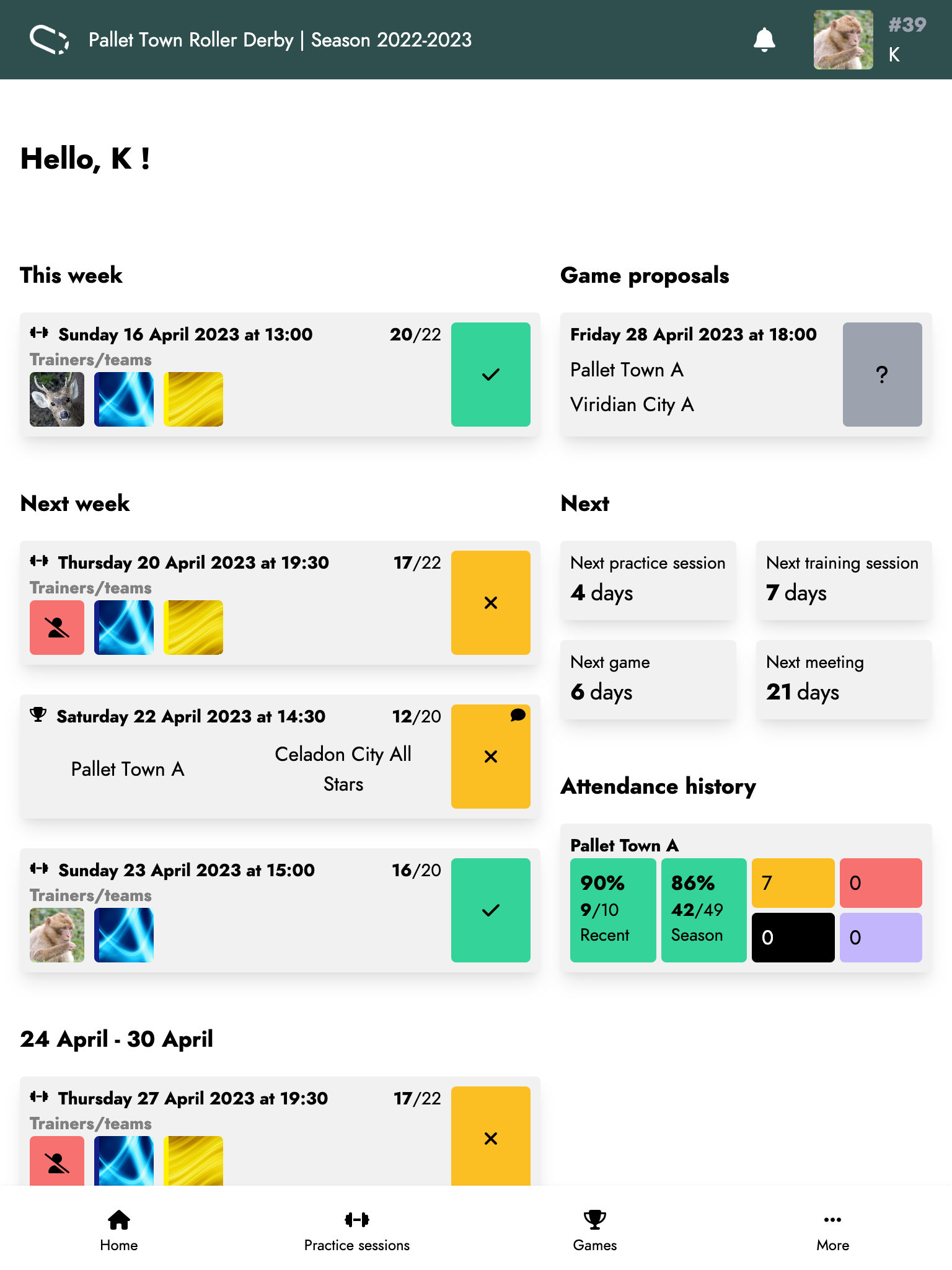
This reflection begins as soon as you arrive on the homepage. It has been completely revamped to give you a quick overview of everything happening in your league. On the left, you will find a list of upcoming events (practice sessions, games, and meetings) for the month, grouped by week for easy reading. For each event, you can directly update your availability. On the right, a set of contextual widgets give you a quick view of a range of features offered by Trackkarma. For example, this is where you can see your pending game proposals, your attendance history, or the status of your membership fees.
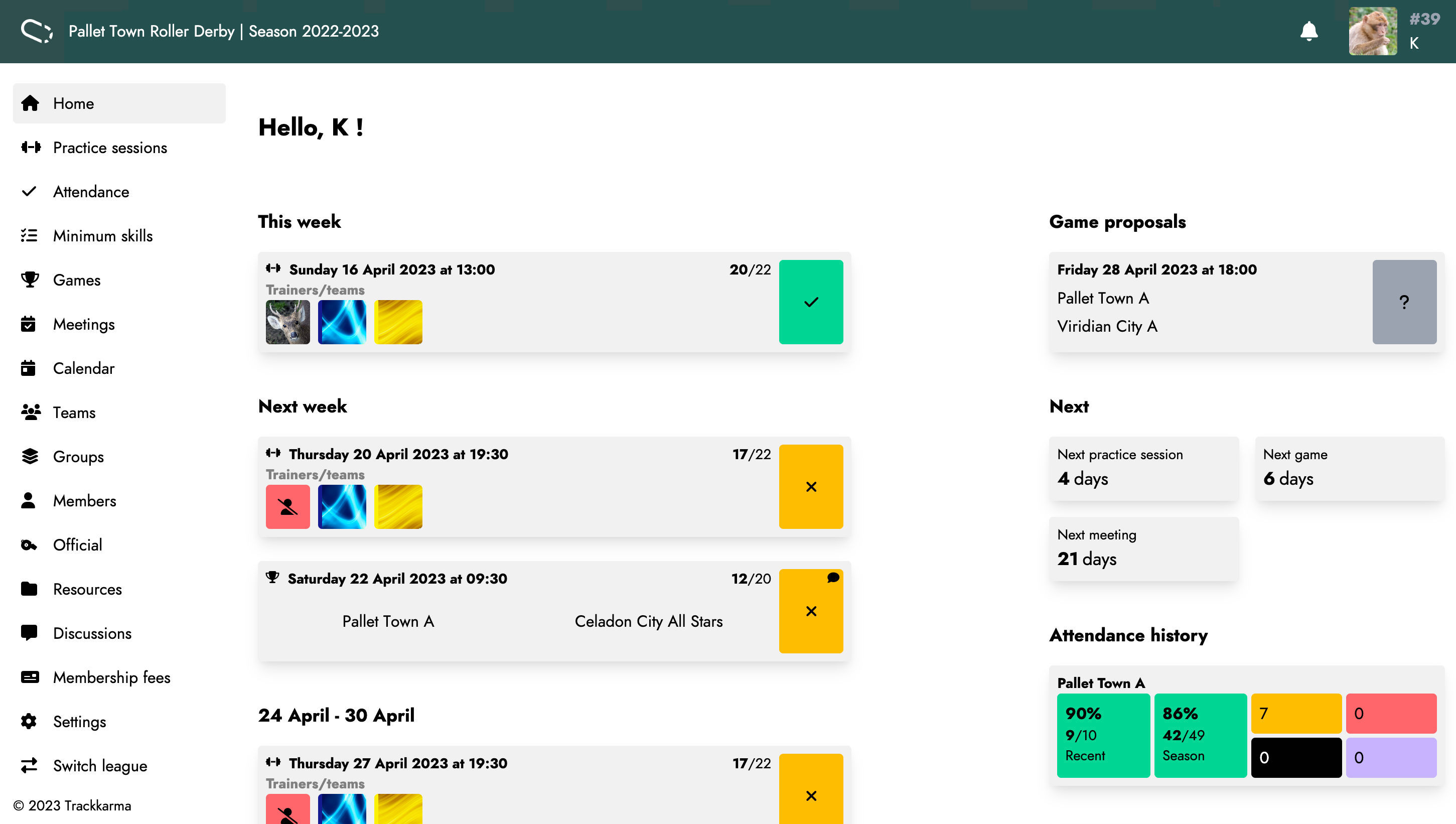
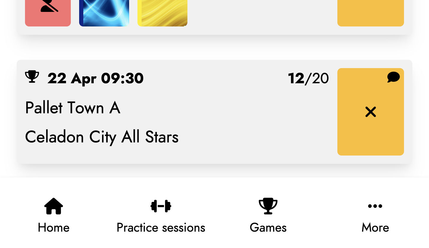
The menu bar has also been completely redesigned. All the features are now grouped by theme and are displayed or not depending on the access rights defined in your profile. On mobile, this side navigation bar disappears in favor of a menu at the bottom of the screen, more compact and easily accessible, highlighting the most commonly used features by Trackkarma users.
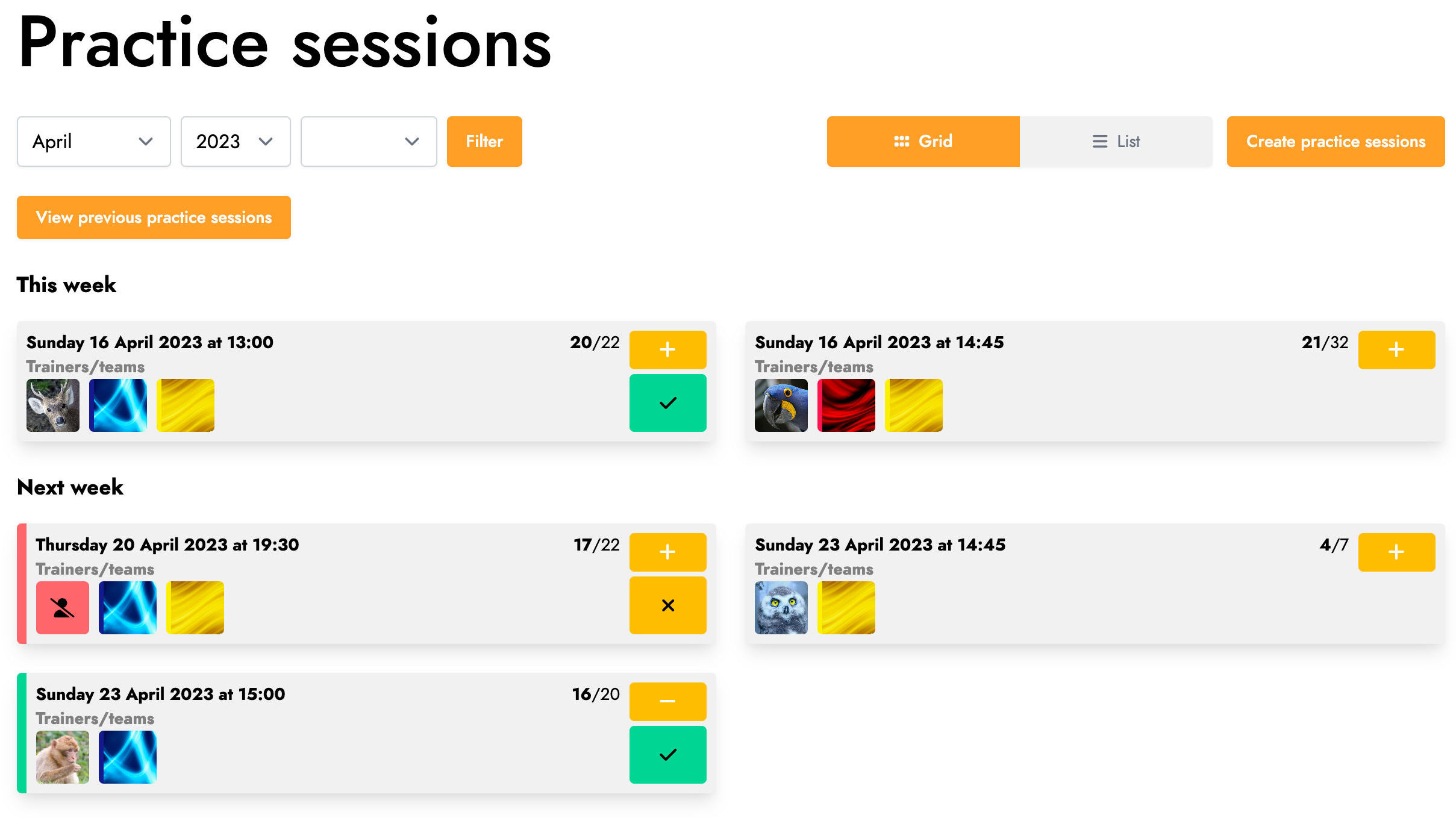
The overall navigation throughout the screens has also been completely redesigned. Previously, the screens sometimes tended to not always follow the same logic, making interactions unintuitive because they were different from one feature to another. In the new version of Trackkarma, this logic has been standardized and all screens now behave similarly to ensure simple and consistent navigation.
Thus, on a screen listing a series of items, such as practice sessions, games, or members, you will always find the page title in the first place. Then, the different possible actions on the items on the page will appear. On the left, filters allow you to limit the number of displayed items and only list the items that are relevant to you. On the right, you can choose between a grid or list view of the items. Finally, the possible actions on the screen are displayed, sometimes grouped in a menu when there are too many to maintain readability. Of course, the number of visible actions depends on the number of rights associated with your account.
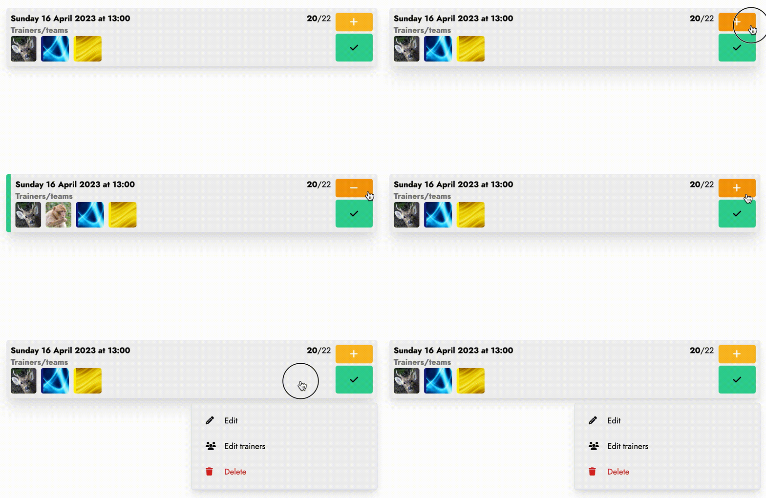
In the center of these screens, you will find the elements themselves displayed as cards or tables depending on the selected display mode. In 'Grid' mode, the cards give you a quick and complete overview of the elements as well as the ability to act directly on them. For example, in the context of practice sessions, you can quickly check the number of available members, trainers, and teams involved. You can also change your own availability and add/remove yourself from the list of trainers if you have the right permissions. Finally, by performing a long press on the card, you will display the context menu related to the element, allowing you to quickly access a whole range of actions.
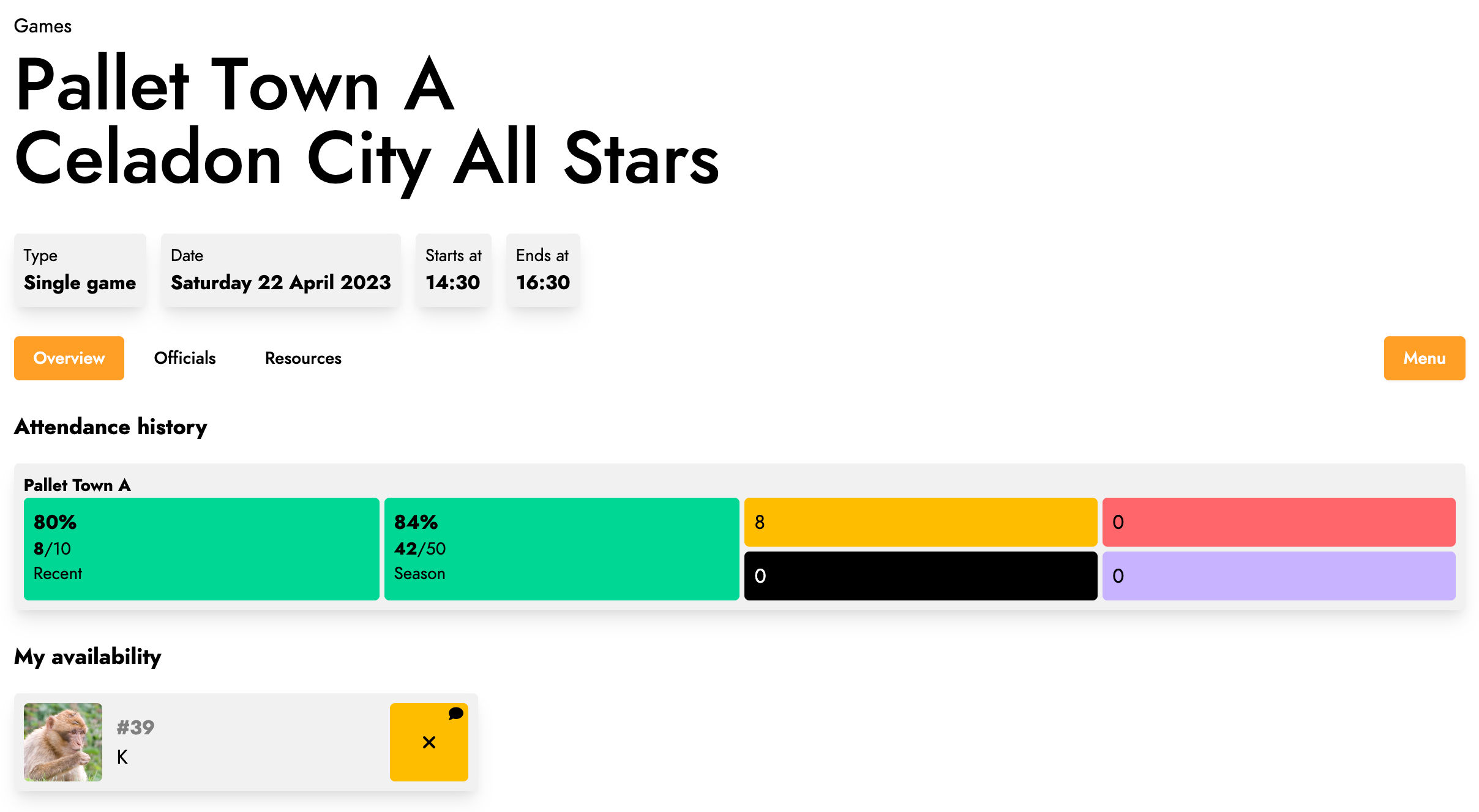
The screens displaying element details have also been redesigned to offer clearer navigation. At the top of the screen, you will find the title of the element as well as its details. For example, in the context of a game, the teams playing the game, the score, and various practical information such as the schedule or address are displayed.
Below, on the left, you'll find tabs that allow you to navigate through the different available views, and on the right, you'll find the actions, possibly grouped into a menu.
This visual overhaul also gave us the opportunity to rethink some screens that were previously lacking in clarity. This was the case with everything related to the settings of your user account or your league. The information was scattered in several places, making it difficult to understand. Now, all the editable settings have been brought together in a common menu and grouped into clearer sections.
Finally, we have always aimed to offer an enjoyable application to use regardless of the screen size on which it is viewed. Whether you are using a computer, tablet or smartphone, Trackkarma remains perfectly usable. Navigation remains simple and generally similar, although visual adaptations exist to take advantage of each screen size. For example, in addition to using the simpler menu at the bottom of the screen on a smartphone mentioned in a previous paragraph, Trackkarma's mobile interface prioritizes icon buttons rather than textual ones to adapt to the reduced available space compared to a computer screen and thus avoid a cluttered navigation.
Even though the previous interface of Trackkarma was relatively simple, we believe that we have moved in the right direction with this new version and thus offer clearer and more consistent navigation, ultimately making it more enjoyable and easier to use!
